
by Katrina G | Apr 16, 2024
Championing new branding with our partners for over 18 years Mirvac is an Australian property group with a clearly defined purpose to reimagine urban life. By creating beautiful homes, inspiring workplace precincts and thriving shopping centres, they aim to make a...
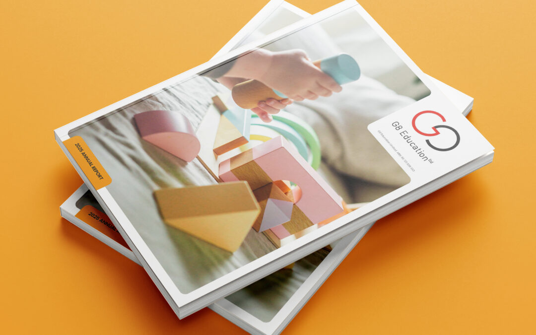
by Anna Sheehy | Mar 4, 2026
Visualising G8’s inaugural Climate Disclosure 2025 report balances emotive, child-centric photography with a data rich aesthetic. The layout features G8’s inaugural mandatory Climate Disclosure, aligning with AASB standards. This design led transparency uses high...
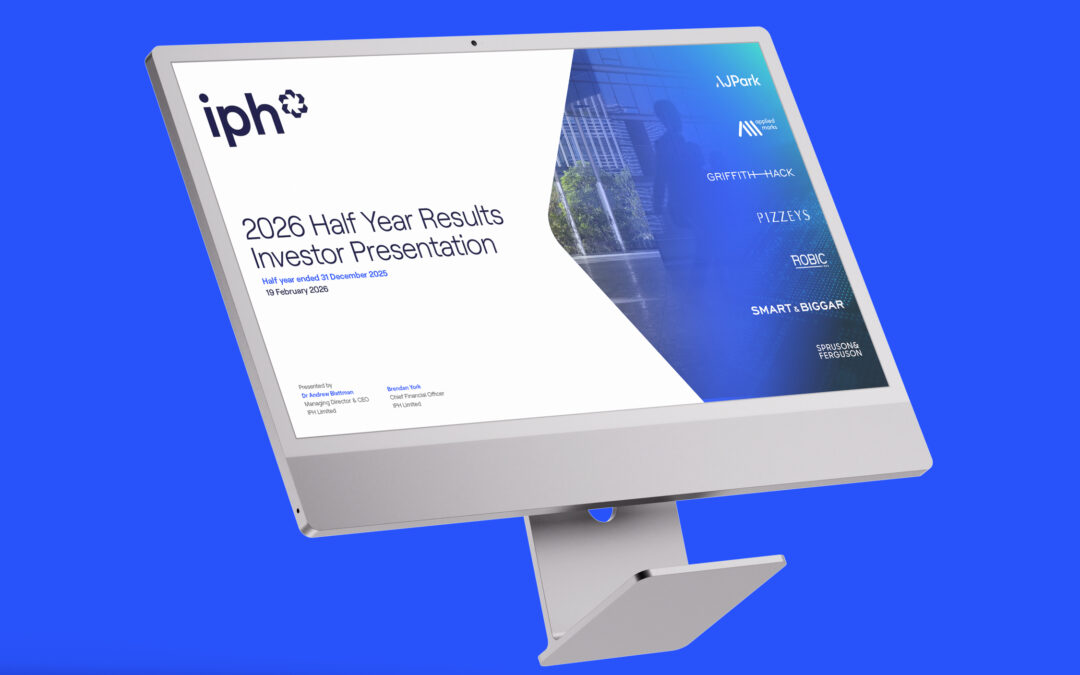
by Anna Sheehy | Mar 9, 2026
Visual precision for financial performance For IPH’s HY26 Results, we translated sophisticated financial data into a clean, executive-level narrative. By balancing structured layouts with high-impact data visualisation, we ensured their global growth and strong...
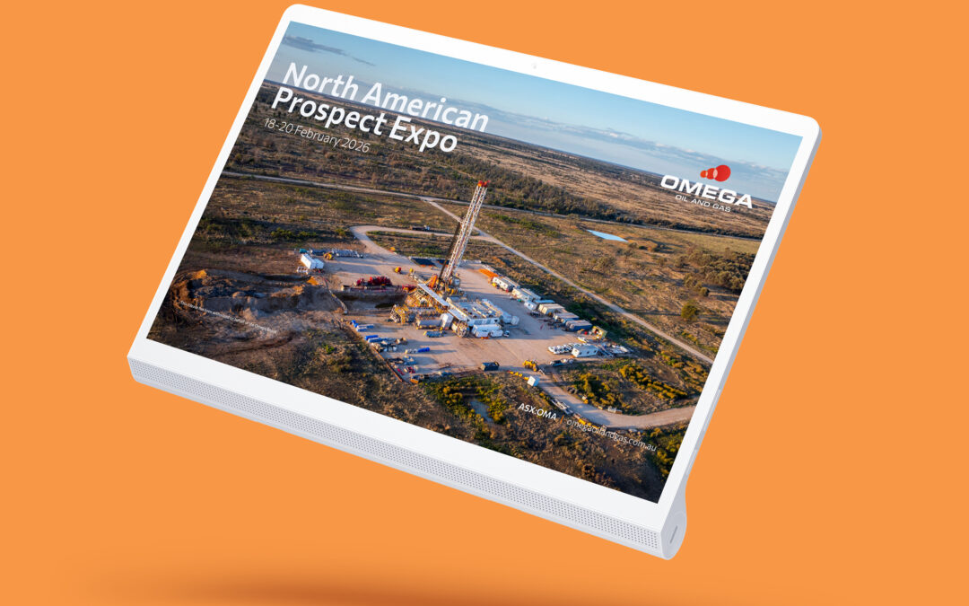
by Anna Sheehy | Mar 9, 2026
Refined continuity for global investors We partnered with Omega to refine their investor presentation for the North American Prospect EXPO (NAPE). By making strategic design adjustments for the US market while maintaining brand continuity, we delivered a polished,...

by Anna Sheehy | Dec 16, 2025
Structured. Insightful. Modern. Precise The FY25 results presentation design delivers a clear, engaging narrative that balances robust financial disclosure with strategic context. The layout seamlessly guides stakeholders through key sections – Overview,...